A simple pie chart
First we need to include 3 Javascript files for Raphael and gRaphael. I've also added jQuery because we'll use it later.
<script src="raphael-min.js"></script>
<script src="g.raphael-min.js"></script>
<script src="g.pie-min.js"></script>
<script src="https://ajax.googleapis.com/ajax/libs/jquery/1.7.2/jquery.min.js"></script>

<div id="pie"></div>
<script>
 var paper = Raphael("pie");
 paper.piechart(
   100, // pie center x coordinate
   100, // pie center y coordinate
   90,  // pie radius
    [18.373, 18.686, 2.867, 23.991, 9.592, 9.213] // values
  );
</script>
Even though the gRaphael front page says to use
paper.g.piechart make sure to use paper.piechart, or you'll get a type error: "Cannot call method 'piechart' of undefined ". 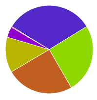
Adding a legend
The chart above shows Microsoft's revenue breakdown between mid-2011 and mid-2012*. We can add a legend by adding an options object as the last argument to `piechart`:
 var paper = Raphael("pie");
 paper.piechart(
   100, // pie center x coordinate
   100, // pie center y coordinate
   90,  // pie radius
    [18.373, 18.686, 2.867, 23.991, 9.592, 0.213], // values
    {
    legend: ["Windows/Windows Live", "Server/Tools", "Online Services", "Business", "Entertainment/Devices", "Unallocated/Other"]
    }
  );
* At least I think so, and I'm no good thinking about finance. Taken from Microsoft Earnings Release FY12 Q4.
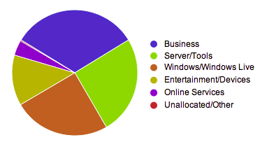
You'll notice that the segments are ordered by their values in descending order. As far as I know there is no option to turn that off.
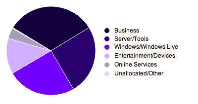
Customizing segment colors
The colors option is very similar to the legend one:
 var paper = Raphael("pie");
 paper.piechart(
   100, // pie center x coordinate
   100, // pie center y coordinate
   90,  // pie radius
    [18.373, 18.686, 2.867, 23.991, 9.592, 0.213], // values
    {
    legend: ["Windows/Windows Live", "Server/Tools", "Online Services", "Business", "Entertainment/Devices", "Unallocated/Other"],
    colors: ["#000038", "#000066", "#0000ff", "#c7c7ff", "#a4a4b7", "#e0e0ef"]
    }
  );
Someone with design skills might even make it look better than the original one...
Other section and the maxSlices option
When there are values that would require lots of small segments gRaphael will merge them into one "Others" segment. Say Microsoft would start divisions for strawberries and carrots:
var paper = Raphael("pie");
 paper.piechart(
   100, // pie center x coordinate
   100, // pie center y coordinate
   90,  // pie radius
    [18.373, 18.686, 2.867, 23.991, 9.592, 0.213, .111, .222], // values
    {
    legend: ["Windows/Windows Live", "Server/Tools", "Online Services", "Business", "Entertainment/Devices", "Unallocated/Other", "Strawberries", "Carrots"],
    colors: ["#000038", "#000066", "#0000ff", "#c7c7ff", "#a4a4b7", "#e0e0ef", "green", "red"]
    }
  );
You can change the text to "Other" by using the legendothers option.
maxSlices can be used to collapse additional segments into "Other".
maxSlices can be used to collapse additional segments into "Other".
 var paper = Raphael("pie");
 paper.piechart(
   100, // pie center x coordinate
   100, // pie center y coordinate
   90,  // pie radius
    [18.373, 18.686, 2.867, 23.991, 9.592, 0.213, .111, .222], // values
    {
    legend: ["Windows/Windows Live", "Server/Tools", "Online Services", "Business", "Entertainment/Devices", "Unallocated/Other", "Strawberries", "Carrots"],
    colors: ["#000038", "#000066", "#0000ff", "#c7c7ff", "#a4a4b7", "#e0e0ef", "green", "red"],
    legendothers: "Other",
    maxSlices: 3
    }
  );

